
Design and development are often presented as two separate stages of product creation. Designers define the experience, prepare the screens, and then pass the work to developers, who are responsible for turning those ideas into a functional product. In practice, the process is rarely that linear.
Many of the decisions that shape the final experience are made while the product is being built. Developers need to understand how the interface responds to different types of data, what happens when an action fails, and how the product should adapt across devices. When those decisions are not clearly communicated, even a well-designed interface can lose consistency as it moves from Figma into a working product.
The screens may show the visual result, but they do not always explain how components behave, how users move between steps, or what should happen when the expected scenario changes. That missing context is what a design handoff needs to solve.
While working on the UI/UX design and handoff of a new digital platform, we saw how quickly questions appeared once developers began reviewing the screens. Which components were reusable? What happened when no data was available? How did permissions affect the interface? Which decisions were essential to the experience, and which could be adapted during development?
Answering those questions early reduces avoidable rework and gives designers and developers a clearer basis for making decisions together.
What is a design handoff?
A design handoff is the process of giving developers the information they need to turn a design into a working product.
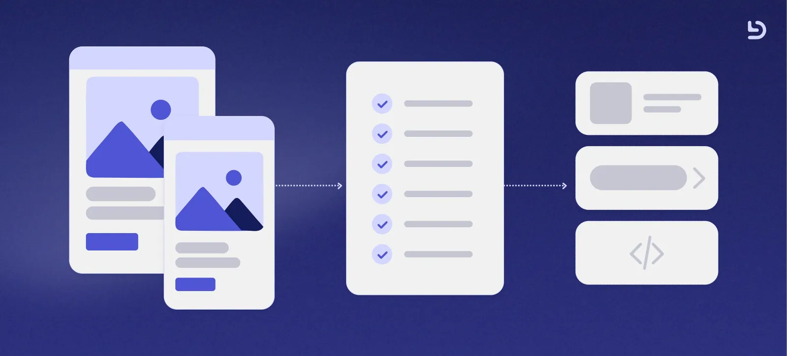
It usually includes final screens, user flows, reusable components, visual specifications, responsive behavior, interactions, and relevant documentation. However, its effectiveness is not determined by the number of assets delivered. What matters is whether developers can understand the intended experience without having to guess.
A developer should be able to identify which screens are final, how users move through the product, how each component behaves, and what should happen when the ideal scenario does not occur.
For this reason, handoff should not be treated as a file delivery at the end of the UI/UX design process. It should be an ongoing exchange of knowledge between design and development.
.webp)
For this reason, handoff should not be treated as a file delivery at the end of the UI/UX design process, but an ongoing exchange of knowledge between design and development.
Why handoff matters for product delivery
A missing state or undefined behavior may appear to be a small issue when reviewing a single screen. Across an entire platform, those gaps can produce duplicated components, inconsistent interactions, additional meetings, and delays.
Consider a table that only appears in its completed state. Developers may still need to determine what users see while the information loads, whether an empty table includes a message or a call to action, how errors are communicated, and what happens on smaller screens. Without that context, the implementation may be technically correct but still differ from the intended experience.
A clear handoff improves the software development process by allowing the team to identify unanswered questions before they become blockers. It also makes technical constraints visible earlier, when the design can still be adjusted without affecting completed work.
The goal is not to anticipate every decision before development starts, new questions will appear as the product is built. The goal is to make the initial direction clear enough that those questions can be resolved deliberately rather than through disconnected assumptions.
The design essentials developers need to understand
Developers do not need to become designers, but they should understand the decisions that shape the interface they are implementing. The basics of UX design remain relevant throughout development. Users should understand where they are, what actions are available, what the system is doing, and what they need to do next.
Those decisions are often expressed through the interface itself. Hierarchy helps users identify the most important information. Feedback confirms whether an action succeeded or failed, consistency makes familiar patterns easier to recognize and clear user flows reduce unnecessary steps and confusion.
The same applies to the main principles of design, including hierarchy, contrast, spacing, alignment, and consistency. These are not details added only to make a screen look polished. They organize information and establish relationships between actions, content, and navigation.
The different elements of design, such as typography, color, icons, spacing, and layout, should therefore be documented consistently. A developer may be able to inspect the font size or color of a button in Figma, but those values do not explain why that action is visually prominent or how its importance changes in another context.
These visual design principles give meaning to the specifications. Effective user interface design communicates not only what an element looks like, but also what role it plays within the experience.
Use a design system as a shared language
A design system creates a practical connection between UX and UI design and development. Instead of treating every screen as an independent composition, it establishes reusable patterns for elements such as buttons, inputs, cards, tables, navigation, typography, colors, and spacing.
Components should also include their different variants and states. For example, a button may have primary and secondary versions, different sizes, icons, and disabled or loading states. An input may need default, focus, completed, and error states.
Defining these possibilities in advance helps developers understand how the interface should behave and reduces the risk of similar elements being implemented differently across the product.
Whenever possible, the components used in Figma should follow a logic similar to the components created in code. They do not need to be identical, but consistent names and structures make conversations between designers and developers clearer.
A UX/UI designer contributes to this shared language by documenting patterns and identifying where new components are needed. A design system is therefore more than a visual library. It is an agreement about how UI and UX design should behave and evolve as the product grows.
Document more than the final screens
A polished screen usually represents the ideal scenario: data loads correctly, content fits within the available space, the user completes every field, and the action succeeds. Real products must also handle the situations that appear around that ideal flow.
These may include:
- Loading and processing states.
- Empty results.
- Validation and system errors.
- Long or missing content.
- Different roles and permissions.
- Disabled or unavailable actions.
- Success confirmation.
- Responsive behavior.
- Interrupted or partially completed processes.
Not every scenario needs a separate high-fidelity screen. Depending on its complexity, designers can use component variants, short annotations, written notes, or interactive prototypes. The objective is to communicate how the interface responds, not only how it looks.
This is especially important when preparing UX design for developers. Design tools already expose measurements, typography, colors, and spacing. What developers cannot always inspect is the reasoning behind a decision. They may need to know why one action is prioritized over another, whether content should expand or be truncated, what happens after a form is submitted, or how the interface changes according to the user’s permissions.
Documenting that context gives developers enough information to preserve the intended experience while making the technical decisions required to build it.
When people ask what design thinking is, it is often described as a process for understanding problems, exploring solutions, testing ideas, and improving them through iteration. That process should not end when the final interface is approved.
Development can reveal technical constraints, missing states, unexpected data, or new opportunities to simplify the experience. These discoveries are part of building the product, not necessarily evidence that the original design failed. Developers should therefore be involved before every screen is complete. Early conversations can identify existing components, feasibility concerns, and edge cases before they become expensive to change.
Once the designs are ready, a handoff meeting can focus on the main user flow, reusable components, complex interactions, and open questions. Designers should then remain available while the feature is being implemented. This collaboration helps connect ux and ui design decisions with technical reality.
At Devlane, this collaboration is part of how our product teams work. Through our IT outsourcing services, companies can bring together UX/UI designers, developers, QA engineers, and technical leaders according to the needs of each product. This shared context allows the team to make better product decisions without treating design and development as isolated responsibilities.
Review the Experience During Implementation
A design review during implementation, often called design QA, complements the broader quality assurance process by allowing the team to compare the working product with the intended experience. The review may cover component usage, interactions, responsive behavior, accessibility, visual consistency, and system feedback.
The purpose is not to reproduce every pixel from Figma without considering the implementation. Some changes may be necessary because of technical requirements, available data, or information discovered during development. The important distinction is whether those changes are intentional.
When designers and developers review them together, the team can decide whether to update the implementation, adapt the design, or document a new pattern for future use.
Design QA also provides useful feedback about the handoff process. If developers repeatedly ask the same type of question, the team may need to add a missing component state, improve its documentation, or involve engineering earlier in similar features.
A Simple Design Handoff Checklist
Before a feature moves into development, confirm that the final screens and user flows are clearly identified, components and their main states are defined, responsive behavior is explained, and loading, error, empty, and success scenarios have been considered.
Developers should also have an opportunity to review the designs, raise questions, and communicate with the designer throughout implementation.
The exact process will vary between teams, but having a repeatable approach makes each handoff clearer and more consistent.
Better Handoffs Create Better Products
An effective design handoff is not simply an organized Figma file. It is a collaborative process that connects design decisions with technical implementation. Clear documentation, reusable components, defined behaviors, and ongoing communication help reduce rework and improve product delivery.
Good UI/UX design does not end when the screens are approved, it continues through the decisions made while the product is built, reviewed, and improved.
At Devlane, our cross-functional teams bring design and engineering together throughout the product development process, from early discovery and UX decisions to implementation, QA, and launch. Whether you are building a new product, or looking for a team that can support your next stage of growth, we can help you move your ideas forward.
.webp)

Other Blog Posts
.webp)
How to Build an AI Agent for Production